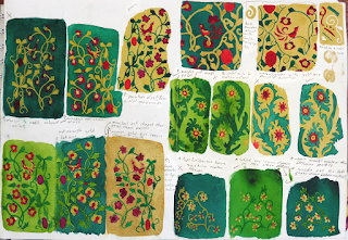
Mostly working out the gold to
other colour ratio in my patterns… And how to get the gold to stay on, not get
everywhere and have crisp lines. I ended up going with a brass powder/golden calligraphy
ink/water mix for the gold, it gave a nice shiny result and anything else I
tried came out very cold looking. it also could be pre-mixed when I added it so
I didn't have to try and drop brass powder onto PVA and watch it go everywhere.
Working out my overall colour palette. I
started with picking colours I liked from other pictures (the little bunches of
strips) and then decided that none of them worked.
So, I then went with playing around with my own
colour ideas (the wheels) and being indecisive between different ones that were
near identical. I know it was going to contain green and gold.... adding the
other colours in shouldn't have been so hard.
I believe I went with the 3rd wheel along (I
worked from bottom right up so it was one of the last ones) and ended up
turning that into the crossword puzzle like shape at the bottom, then I removed
a bunch of colours from that.
Lastly was working out where on the drawing
each colour should go and where should have the most gold. I went with number
4.
.... I think the green/blue thing on the left
was an attempt at removing the shininess of the cling film technique by
spraying water on it?
More colour tests, trying to
work out exactly what colours each pattern should have on it....and more of
trying to get the gold mix to work right..... I was so so indecisive when it
came to the colours for this project. ^^;
At least it's rather pretty when the light catches it.


No comments:
Post a Comment